How Does Color Theory Affect Web Design?
Did you know that there are 16.8 million colors to choose from when designing a website? To give you some perspective, browsing through every individual color would take almost half a year! With so many color options, how do you pick a palette for your website? Read on to learn about color theory and the things to consider when developing your website's color scheme.
To summarize, color theory in web design comes down to three main things:
Complementation :: How colors are seen in relation to one another.
Contrast :: How colors are used to reduce eyestrain and command your attention to certain elements on a page.
Vibrancy :: How colors are used to influence your emotions or attract a specific target market.
Your user should feel something the moment they land on your site. According to Colorcom, research shows that it takes only 90 seconds for people to make a subconscious judgment about a product--and much of that assessment is based on color alone.
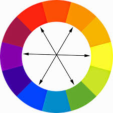
Remember the color wheel from school?
If not, here's a refresher.
There are 3 primary colors: red, yellow, and blue. These primary colors are the foundation of all other colors, and they can't be created by mixing other colors.
Secondary colors are formed by mixing two primary colors: blue and yellow make green, red and yellow make orange.
Tertiary colors are derived by combining primary and secondary colors: blue-green or red-orange.
Complementary colors are found on opposite sides of the color wheel from each other.
When used harmoniously, these colors create a balanced contrast and vibrancy. This "color harmony" is about the arrangement of the colors in design; the most attractive and effective way to display them. When colors are organized, viewers feel pleased and calm; when they're not, confusion and hesitation take over.
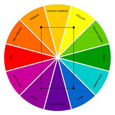
Here are the major color schemes used:
Monochromatic :: based on one color with various tones and shades of it.
Analogous :: use of colors located right next to each other on the color wheel.
Complementary :: is the mix of colors placed in front of each other on the color wheel. This scheme is opposite to analogous and monochromatic since it aims to produce high contrast.
Split-Complementary :: is similar to the previous one but has more colors. The contrast here is less sharp than in complementary scheme but it allows using more colors.
Triadic :: based on three separate colors which are equidistant on the color wheel.
Tetradic/Double-Complementary :: uses four colors from the wheel which are complementary pairs. If you connect the points on the chosen colors they form the rectangle.
What Colors Evoke
We're catching feelings... Here are some of the common emotions that colors evoke and some examples of how companies leverage these colors.
Red
Red is associated with warmth, electricity, and energy. A hot, stimulating color, red can also symbolize love, passion, power or anger/danger.
Examples in Web Design: https://us.coca-cola.com/ & https://www.xcelenergy.com/
Blue
Calming, strength, professional is what comes to mind with blue shades. A very dependable color, blue signifies stability, expertise, and trust.
Examples in Web Design: https://www.denverhealth.org/
Yellow
Exciting and electric. The brightest color and often considered the most energizing. Associated with joy, happiness, sunshine, and intelligence, it’s a positive, optimistic color.
Examples in Web Design: https://www.snapchat.com/
Orange
Orange is an electric and a cheerful color that evokes joy and happiness and is generally regarded as friendly. You can see why we chose orange to represent the Bigfoot brand and website!
Examples in Web Design: https://www.bigfootweb.com/
Green
Cool, calming, professional. Bridging the gap between warm and cool colors, green symbolizes nature and has a healing quality, therefore has a lot of positive connotations. It’s also used for growth, harmony, and the environment.
Examples in Web Design: https://www.wholefoodsmarket.com/
Purple
Traditionally the color of royalty, dark purple signifies sophistication, wealth, and luxury. Lighter purple hues represent spring and romance. Also used for creativity, imagination, and spirituality.
Examples in Web Design: https://www.trovecbd.com/
Black
Black commonly shows strength, power, wealth, elegance, and sophistication. Dark palettes are trending in web design, proving that black is versatile and polished.
Examples in Web Design: https://www.apple.com/mac-pro/
Gray
Gray can be used to showcase strength, calmness, power, authority. It also represents tradition, conservatism, and somberness.
Examples in Web Design: https://culturedcode.com/things/
White
Purity, innocence, freshness, cleanliness. Needed so the rest of the site comes into focus.
Examples in Web Design: https://www.google.com/
Color is a powerful tool to impart a specific mood or feeling to your guests every time they visit your website. By using color correctly, your site will impress first-time visitors, increase time on site, improve brand recall, and impact conversions.
If you need a color refresh, reach out to Bigfoot Web. Our web designers can create a custom color palette that speaks directly to your audience!


